
It starts with a feeling. Maybe you’ve walked into a room and thought: it’s nice… but it doesn’t feel like, well, anything at all. The walls are soft white. The couch is greige. The décor is stock. It lacks warmth, identity, personality, soul.
That quiet disconnect is driving a fresh wave of home interior design – one that values emotion, individuality, and self-expression over convention.
More and more Australians are quietly questioning the neutral interiors that have dominated our homes for decades. Beige, once the darling of design for its elegance and versatility, is beginning to feel… flat. In its place? A gentle return to layered, personal, and emotionally connected design.
In this article, we explore the cultural shift in home interior design towards a more personality-led approach that embraces colour – not just for aesthetics, but for the comfort and connection it brings. And we’ll share how you can begin weaving it into your space with confidence.

For years, homeowners have embraced beige and neutrals as the go-to for ‘tasteful’ design. Think taupe lounges, ivory walls, cream cabinetry, and soft-grey carpets – a palette that feels safe, familiar, and easy on the eyes.
But, a quiet rebellion is brewing. Younger homeowners are craving more. Expression. Warmth. Identity. And if neutrals have been our safety net… what exactly is stopping us from using colour as a core design element in our homes?
The cultural comfort of neutrals
Neutrals offer comfort. They’re uncontroversial, universally appealing, and easy to market. Real estate agents love them. Instagram loves them. For years, beige has been our collective default – a visual sigh of relief in a world that moves fast.
We’ve been subtly taught that colour is risky. Too emotional. Too bold. Even indulgent. Older generations saw colour as loud, overpowering, or dated, while neutrals were celebrated as timeless and elegant.
But we’re starting to rewrite that narrative. As Emma Beasley, Creative Director of YesColours, observes: “Many of us hesitate to use bold colours in our homes, finding them daunting or overwhelming. However, this fear can be eased by understanding the principles of colour in interior design. When used thoughtfully, colour creates balance and harmony, evoking the right emotions in a space.”
Why home interior design is starting to change
The transition towards colour isn’t random — it reflects shifting values and a growing desire for spaces that nourish us emotionally. With Gen Z and millennials at the forefront, this change goes far beyond just painting a nursery pink or blue. After extended periods spent at home, Australians are seeking interiors that energise, inspire, and soothe. As part of evolving home interior design, this shift marks a deeper reconnection with emotional wellbeing.
Pinterest fatigue has well and truly set in. The endless scroll of near-identical minimalist spaces feels less like inspiration, more like repetition. In response, homeowners are leaning into eclecticism, maximalism, and thoughtful personalisation. And embracing colour doesn’t have to mean bright neons or clashing tones — more often, it’s earthy palettes, playful contrasts, and rich, textured hues making their way back into Australian homes. It signals a broader cultural movement towards authenticity and emotional resonance in design.
Leading designers echo this shift. “Colour is emotive. And the goal is to make people feel good wherever it is they experience it,” says Julia Green, founder of Greenhouse Interiors. “Colour can work wonders in a space, and set the mood and tone as well. It’s all about knowing when to turn the dial up or down.”

Reframing colour as connection in interior design
Beyond aesthetics, colour carries emotional weight. It’s how we express identity and invite comfort. Like a home-cooked meal or your favourite song, colour is also sensory. It can lift a mood, foster belonging, and reflect the character of a space — and the people who live in it. When chosen with intention, colour can transform a basic room into a personalised sanctuary that meets your emotional needs.
Understanding basic colour theory can empower your decisions. Consider how undertones, balance, and complementary shades work together to create harmony. Soft greens can evoke tranquillity, warm terracotta feels grounding, while deep blues offer a sense of calm.
“Drawing inspiration from colour psychology and our desire for attachment and connection, Dopamine Decor is about curating interiors that make us feel good by stimulating the ‘happy’ hormone in our brains — with spaces that reflect warmth and personality,” says Mark Rielly, Director at ARRCC.
Focus less on trends, and more on intuition. What colours make you feel relaxed? Which hues spark joy or evoke fond memories? And if you’re not quite ready to commit with walls or floors — even subtle shifts through artwork, textiles, or cabinetry accents can dramatically change a room’s energy, making your home feel more like your own.

Building colour confidence
If you’re hesitant to embrace colour fully, you’re not alone. The fear of regret (or choosing clashing tones) can make the process feel daunting. But stepping into colour doesn’t have to be overwhelming.
Start small.
Moodboards, paint samples, or experimenting in low-commitment areas — like an accent wall, powder room, or laundry — can help build confidence gently. And if a choice doesn’t turn out as expected? That’s okay. Every decision is a chance to learn and refine your style.
Consider your home’s natural light, room size, and the emotional tone you want to create. Kitchens may benefit from lively hues that spark creativity, while bedrooms can welcome calming pastels or muted shades that support restful sleep. With thoughtful choices, colour becomes a supportive part of your home, reflecting your personality and serving the needs of each space.
And remember: choosing colour isn’t a test you can fail. It’s about originality and authenticity. There are no right or wrong choices if they genuinely resonate with your sense of self — and make your home feel like you.
At the end of the day, it’s your home to curate.
Moving beyond beige
Beige and its accompanying shades aren’t inherently negative; they’re familiar and reliable. But perhaps safety isn’t what you want most from your home anymore. Maybe your heart longs for connection, identity, and warmth.
Colour quietly shapes the energy of our homes. It has the power to soften or uplift, to bring calm or vibrancy, to evoke memories and spark emotion. When used with intention, colour becomes less about making a statement, and more about creating a feeling. It’s not just about how a space looks, but how it feels to live in.
If you’re ready to explore beyond neutrals but unsure where to begin, you’re not alone. Choosing colour can be deeply personal — even vulnerable — especially when it means moving away from what’s familiar. That’s where steady, thoughtful guidance makes all the difference.
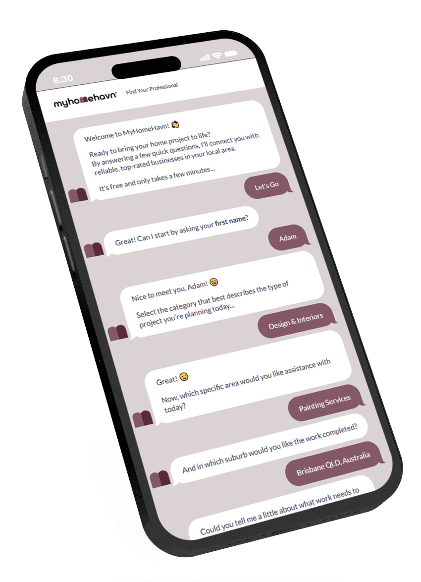
Myhomehavn connects you with interior designers, decorators, and styling professionals who understand how to gently match colour with character, helping you make choices that are both practical and deeply personal. With the right support, bringing colour into your home doesn’t have to feel risky. It can feel like clarity.
Colour makes a splash, but it’s personal, not performative. It asks for consideration, not courage. Choosing colour means choosing to reflect who you are, and how you want to feel in your space. And with thoughtful support, that decision can be steady, informed, and deeply your own — aligned with a new wave of home interior design that places personality at the centre.